Responsive Web Design
When Ethan Marcotte first coined the term “Responsive Web Design” back in 2010, he pointed out that, in addition to a fluid grid and flexible images, media queries was the last crucial ingredient in making a website responsive.
We use media queries in a conservative way, mainly checking for conditions around screen width.
The media query syntax can be quite verbose, so to help write simpler code, we use a library called Sass MQ.
The design system provides a set of predefined breakpoints, This makes responsive layout clean, simple, and predictable.
In _conf_mq.scss you’ll find our configuration for Sass MQ.
Breakpoints
We base our available breakpoints on suggestions from Google. They cover a wide range of common device widths.
| Breakpoint | Size | Description | Columns |
|---|---|---|---|
all |
0 | from 0px and up | 12 |
mob-s |
320px | Mobile small | 12 |
mob-m |
375px | Mobile medium | 12 |
mob-l |
425px | Mobile large | 12 |
tab-s |
600px | Tablet small | 12 |
tab-m |
768px | Tablet medium | 12 |
tab-l |
1024px | Tablet large | 12 |
ltp-s |
1280px | Laptop small | 12 |
ltp-m |
1440px | Laptop medium | 12 |
ltp-l |
1600px | Laptop large | 12 |
dtp |
1920px | desktop | 12 |
wqhd |
2560px | 2K Monitor | 12 |
Try to avoid using other breakpoints than these, as they should give a sufficient and predictable set of options.
Syntax using Sass MQ
When writing a media query using Sass MQ, the syntax is quite simple:
// Scss
.foo {
    @include mq($until: tab-m) {
        color: red;
    }

    @include mq($from: tab-m, $until: ltp-l) {
        color: green;
    }

    @include mq($from: ltp-l) {
        color: blue;
    }
}
This compiles to:
// Css
// Up to medium tablet (768px)
@media screen and (max-width: 48.0525em) {
    .foo {
        color: red;
    }
}

// Between medium tablet (769px) and large laptop (1600px)
@media screen and (min-width: 48.0625em) and (max-width: 100.0525em) {
    .foo {
        color: green;
    }
}

// From large laptop (1601px)
@media screen and (min-width: 100.0625em) {
    .foo {
        color: blue;
    }
}
Please see the documentation for Sass MQ for more options.
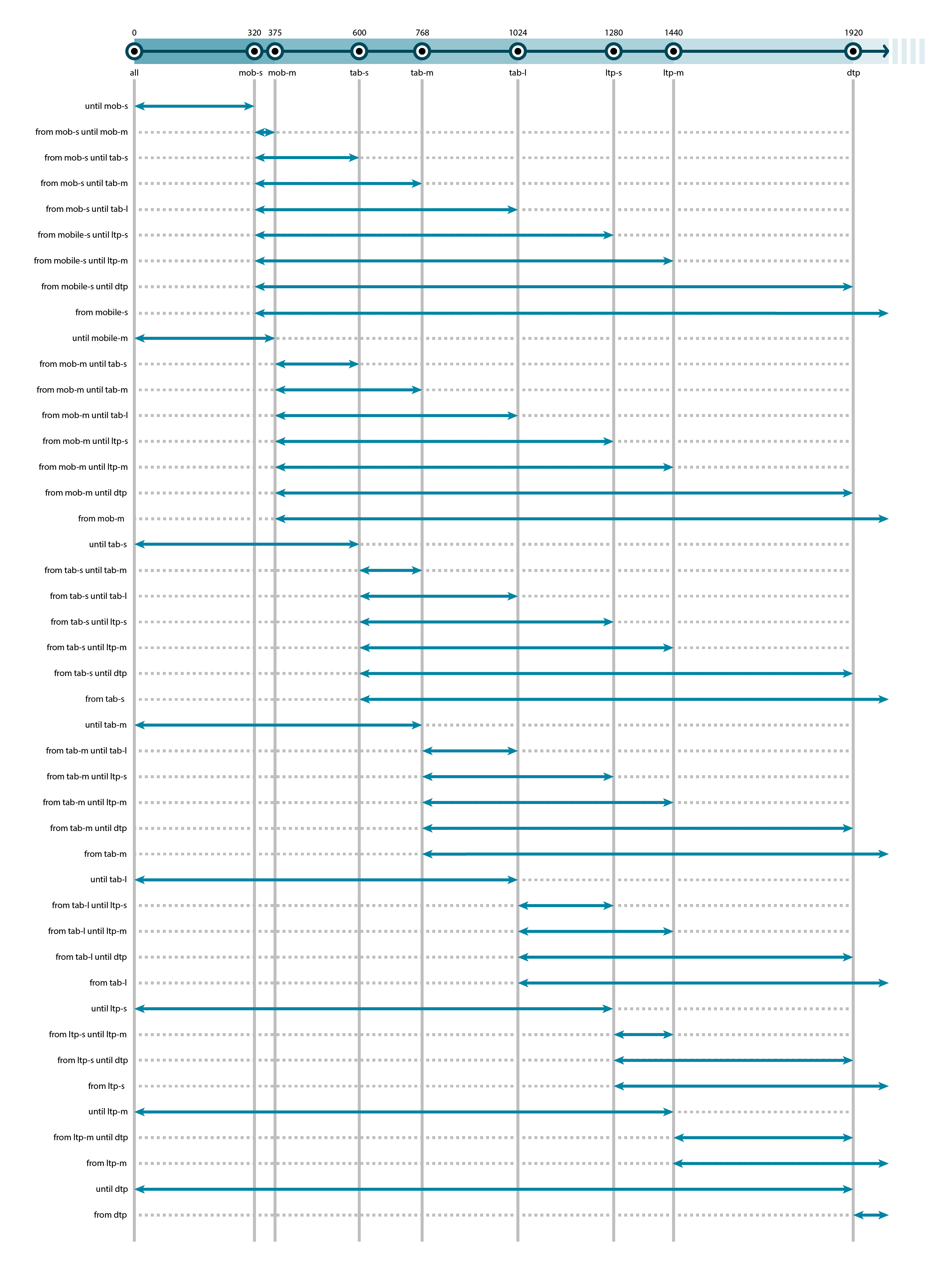
Breakpoint Graph
Here is a complete overview of variations using the predefined breakpoints
combined with parameters $from, $until and combinations of both (between).